malto
february 14th 2009
it/that/any
brazilian (pt/eng)
goat demon thing
artist
taken by my
bf and fictional wife

about me

hey , I'm malto ! you probably know me from twitter , but I also make drawings , games , and websites such as this one !
I really REALLY love creating things , that has been one of my passions ever since I was little , especially 
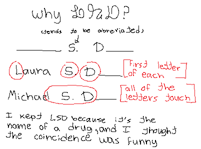
drawing and painting . if you've seen any of my drawings , chances are it wasn't signed (because I keep forgetting to) , or it was signed either as malto or LSD ! here's a little graphic explaining the second signature
other than art , I also have other special interests like nature/animals (my favorites are beetles if that wasn't obvious) and CRINGER REVIEWS . that man has consumed my entire life and I hate him , though I can't help but be extremely interested in his stupid little videos and life (more about him here) ...
my other interests:

tip: hover over the charactes to find out who they are !

my fursona
reference sheet

have you ever wanted to find out about this website's history ? probably not but today is your lucky day as I have docummented it all here !

about this website

I have had my own corner of the internet for a while now , but it wasn't hand-coded like it is now . I used to have one back in ~2022 (?) and it was called malto.uwu.ai (on carrd) , but it has sadly been deleted . version 1.0 of this one on the other hand was started all the way back in 2023 and it used to look like this:

... not my greatest work , I know , but back then all that I knew were the basics of html because of goatlings (iykyk) , though when 2025 came I actually started learning more and now had enough knowledge to make 2.0 slightly more cool looking:

it was still just text and a few gifs , but after a while I found out how to make boxes to turn 3.0's layout slightly more interesting and even added a whole ass BANNER ! shocking , I know ... it was a little too large though ...
this was also around the time I was starting to lean slightly on frutiger aero , evident by the buttons and color scheme:

around october the website got a slight upgrade , 4.0 , finally fixing the banner's proportions and getting a visual upgrade ! the layout was still pretty similar but got a little update as I learned how to better position the boxes and more css to make things ever more costumized . they're now transparent to have that glossy look to them ! probably my second favorite version , lol:

now we have this ... I don't like this one very much , it's a little too bland for me , but I kind of see the vision . this is a step on the right direction though because now I actually found out how to make more unique layouts without having to put too much work on it , huzzah ! I never really finished this version , I only published the home and gallery pages (the only ones I made) and then scrapped it .

now we have 5.0 , the version you're looking at right now ! yay

last updated: december '25